DESIGN FILES :: FOREVER SPRING
- Nisrine El Lababidi
- Mar 8, 2019
- 4 min read

I'm so happy to finally share with you this house we worked on in the late summer of 2017... yes you read that right 2017! for some reason we never got around to photograph it - but it has always been on our to do list and it is a very dear house as it is one of friend and a return client! We had designed this for her apartment in JLT before they had moved to the Springs Community.
With this move came a few challenges... her previous sectional no longer fit the new house, so that had to go. Some of the items they had were rearranged - in different rooms - and many new furniture and accessories were added.
We sought out to maximize the light in the spaces and to keep it minimal yet colorful, reflecting colors from the beautiful garden and lake surrounding the house.
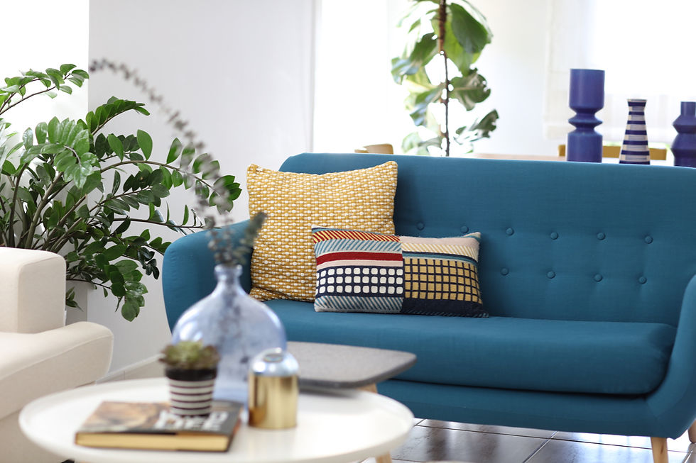
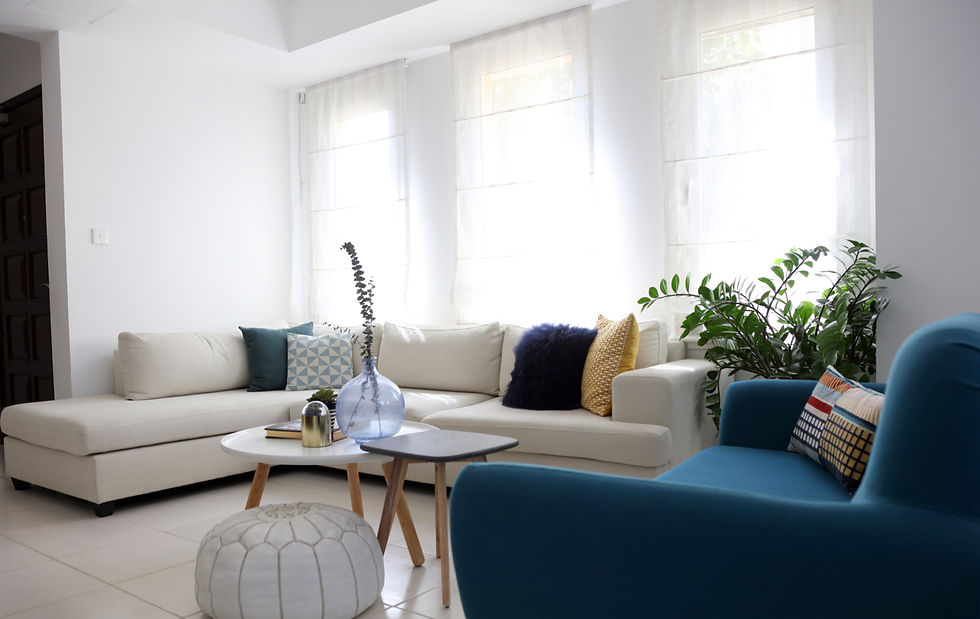
In the living space, we had to replace the BoConcept sectional with a new off-white smaller one to fit the space and complimented it with a slim mid-century style two seater. And while we kept the tables and the dining room as is, we added new slim glass shelving and a wooden mid century style tv unit to the space.
The accessories were selected for their bold textures and graphic colors - where less is more ... less clutter more impact that is! They also added a nice playful touch for a lively house with two kids. You will also notice the abundance of greenery.. just compare how much those house plants especially the fiddle fig tree has grown since we bought them for the previous house!
Get this look//Living & Dining Room
Sectional sofa - ID DESIGN
2 Seater sofa - Maison Du Monde
Cushions - West Elm, Maison Du Monde
Coffee Tables - ID DESIGN
TV Unit - Indigo Living
Dining Room Shelving - IKEA
Accessories - West Elm, H&M Home
Blinds - Custom made at Jumeirah Curtains





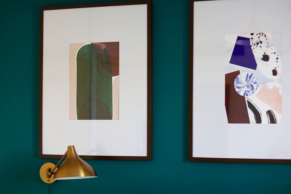
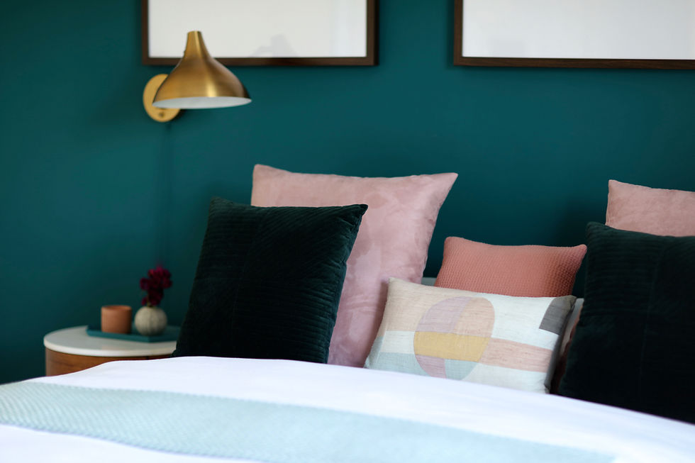
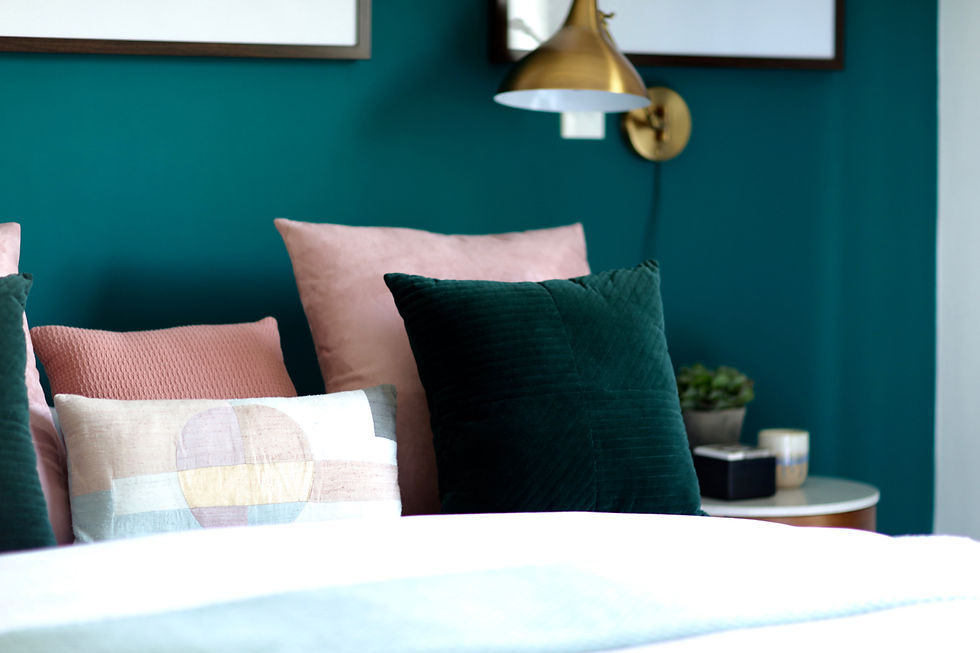
Moving upstairs, to our favorite room - the Master Bedroom - we wanted to make the most impact and solve a critical issue of having three non centered square windows on top of the bed. The solution we opted for was to paint the bold intense teal color and hid the windows behind three large scale graphic prints. The result a bedroom that truly lures you in with its color.
The bed was kept the same from the previous house, but we added two mid-century style bedside tables and a matching dresser with a round brass mirror with marble detail on top. The wall lamps, with their brass finish, also added an nice compliment to the wood color. while the bench, that was previously in the entrance, was now placed at the end of the bed. The curtains and the accessories were again simplistic with bold graphic elements, playing on the tones of pink, ochre and green.
Get this look//Master Bed Room
Cushions - West Elm, Maison Du Monde
Bed Side Tables, Bench, Mirror & Dresser - West Elm
Curtains - Maison Du Monde
Accessories - Bloomingdales, H&M home, Hay design
Wall Lamps - West Elm
Prints - theposterclub.com





Moving along to the daughter's bedroom, we kept the soft pink theme, which was obviously her favorite, and we added equal doses of gold, rose gold and whites to balance it all out.
The sweet space was amplified by the speckles of gold stickers, we stuck one by one! and the rattan headboard and ceiling lamp which we added. Though the space was small, we managed to give her a desk space, a mini dresser and a reading corner as well (thanks to the floating plexiglass shelving)!
The custom made grey blinds in textured cotton along with the plush throw pillows in various prints and fuzzy fur gave it a sophisticated touch. Cute little flamingo accessories and a heart shaped neon light meant the room was just the right amount of sweet!
Get this look//Girls' Room
Cushions - Pottery Barn Kids, Maison Du Monde, The One
Bed Headboard- Tribe Dubai
Blinds - Custom made by Jumeirah Curtains
Accessories -, H&M home, Maison Du Monde, IKEA
Dresser, ceiling lamp & Desk Chair - IKEA
Carpet - Zara Home
Metal Shelves - JYSK
Mirror - Maison Du Monde
Plexi Shelves, eyelashes - ETSY.com


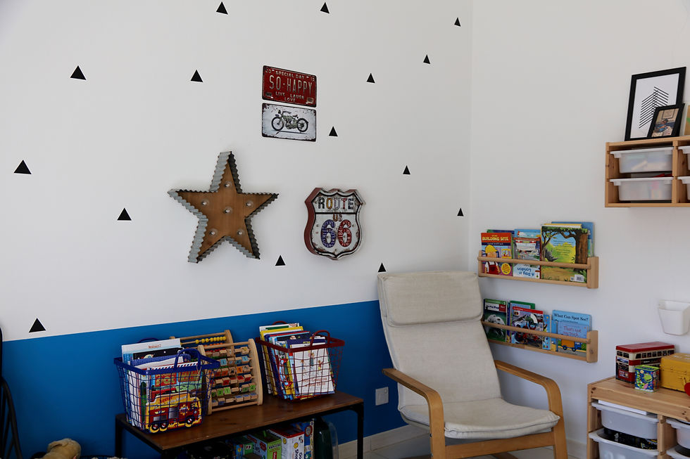
In the boys' room, we kept the bold graphic look with a color scheme of blue, black and white opting to paint a third of the wall instead of a full wall so as not to over power the space, while adding triangular stickers for interest.
The entire look was a bit more industrial - fit for a young car lover! The metal bed and toys storage and baskets gave it that edge as well. A small reading corder was added and plenty of boxes for all the toys meant that clutter was easily managed even by the little toddler.
Get this look//Boys' Room
Bedding - IKEA, Maison Du Monde
Bed, Light & Storage- IKEA
Blinds - Custom made by Jumeirah Curtains
Wall Accessories - Dragon Mart
Carpet - Zara Home




All in all we managed to maximize the house space with its bold choice of colors and patterns and keep it interesting for the entire family to enjoy.
We are scouting for houses to feature on our blog, so if you have a styled home with clever ideas that are breaking the rules, I"D LOVE TO TAKE A PEEK. ⠀
Email us pictures to: hello@harfnoondesignstudio.com
SaveSaveSave


